Background
Correlation analysis is helpful to identify associations between different variables (measurements). For databases with combinations of qualitative and quantitative data, we use this as a preliminary step to understand the likely relationships, or potential explanatory value of different measurements. We will apply some examples here based on tidyverse to estimate the correlation coefficients based on different methods. We will also visualize the associations graphically. Two primary packages we need for this example are Hmisc y de corrplot. We will also use the package readr to read data into R.
library(tidyverse)
library(Hmisc)
library(corrplot)
library(readr)
Database
There are different options for working with data that is in a local folder. For many, the manual options with a data import are easier, but it is also useful to understand how you can directly read data into R. We will use both at time during the workshop, so do not stress too much for now.
# Introduce the data to R - in this situation, we apply the function read_csv the most important item is to know the physical location of the file. In this example, I mainain a copy in Documents folder on my Mac

correlations <- read_csv("Correlations.csv")
correlations
## # A tibble: 54 x 6
## Treatment Count1 Count2 Yield Protein Oil
## <dbl> <dbl> <dbl> <dbl> <dbl> <dbl>
## 1 1 241 241 2569. 35.4 19.6
## 2 1 241 250. 2905. 35.8 19.5
## 3 1 241 250. 3186. 36.2 19.3
## 4 2 396. 482 2887. 36 19
## 5 2 284 275. 3389. 36.3 19.4
## 6 2 293. 310. 3482. 35.5 19.3
## 7 3 465. 473. 2836. 35.6 19.5
## 8 3 422. 456. 3361. 36.2 19.7
## 9 3 370. 379. 3569. 36.4 19.1
## 10 4 413. 448. 2919. 33.9 20
## # ... with 44 more rowsPearson
We will begin with the first type of correlation, which is the Pearson correlation. In this situation, we assume that we have quantitative variables. Depending on the database, you may just define the function by calling the name of the database. Nonetheless, we do need to understand our database and “clean” this some, especially to ignore the first column that defines some treatment. We will then use the function rcorr. This function allows us to perform two types of analyses: (1) Pearson and (2) Spearman (nonparametric method).
In R, and this is something that will carry throughout different types of models and analyses, there are often different packages and functions that we can use. Each has its advantages and disadvantages, for example, some functions do not provide a test statistic. In other cases the method does not permit the use of some of the graphical methods to visualize the associations.
# In this first example, the "select" option is indicating that we will use all columns except the first one, which is for treatment

example_cor <- correlations %>%
  select(-Treatment) %>%
  as.matrix() %>%
  rcorr(type = "pearson")

example_cor
## Count1 Count2 Yield Protein Oil
## Count1 1.00 0.98 0.27 0.02 -0.10
## Count2 0.98 1.00 0.23 0.00 -0.09
## Yield 0.27 0.23 1.00 -0.13 -0.25
## Protein 0.02 0.00 -0.13 1.00 -0.38
## Oil -0.10 -0.09 -0.25 -0.38 1.00
##
## n= 54
##
##
## P
## Count1 Count2 Yield Protein Oil
## Count1 0.0000 0.0527 0.9077 0.4726
## Count2 0.0000 0.1017 0.9952 0.4999
## Yield 0.0527 0.1017 0.3677 0.0646
## Protein 0.9077 0.9952 0.3677 0.0047
## Oil 0.4726 0.4999 0.0646 0.0047# We will now apply the function corrplot, which is in the package "corrplot" to look at the associations
example_cor2 <- correlations %>%
select(-Treatment) %>%
as.matrix() %>%
cor(method = "pearson")
corrplot(example_cor2, method="number")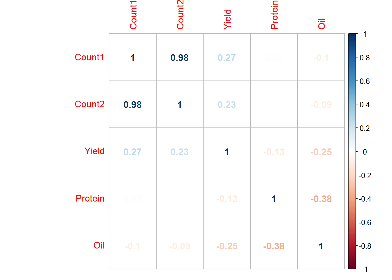
corrplot(example_cor2, method="circle")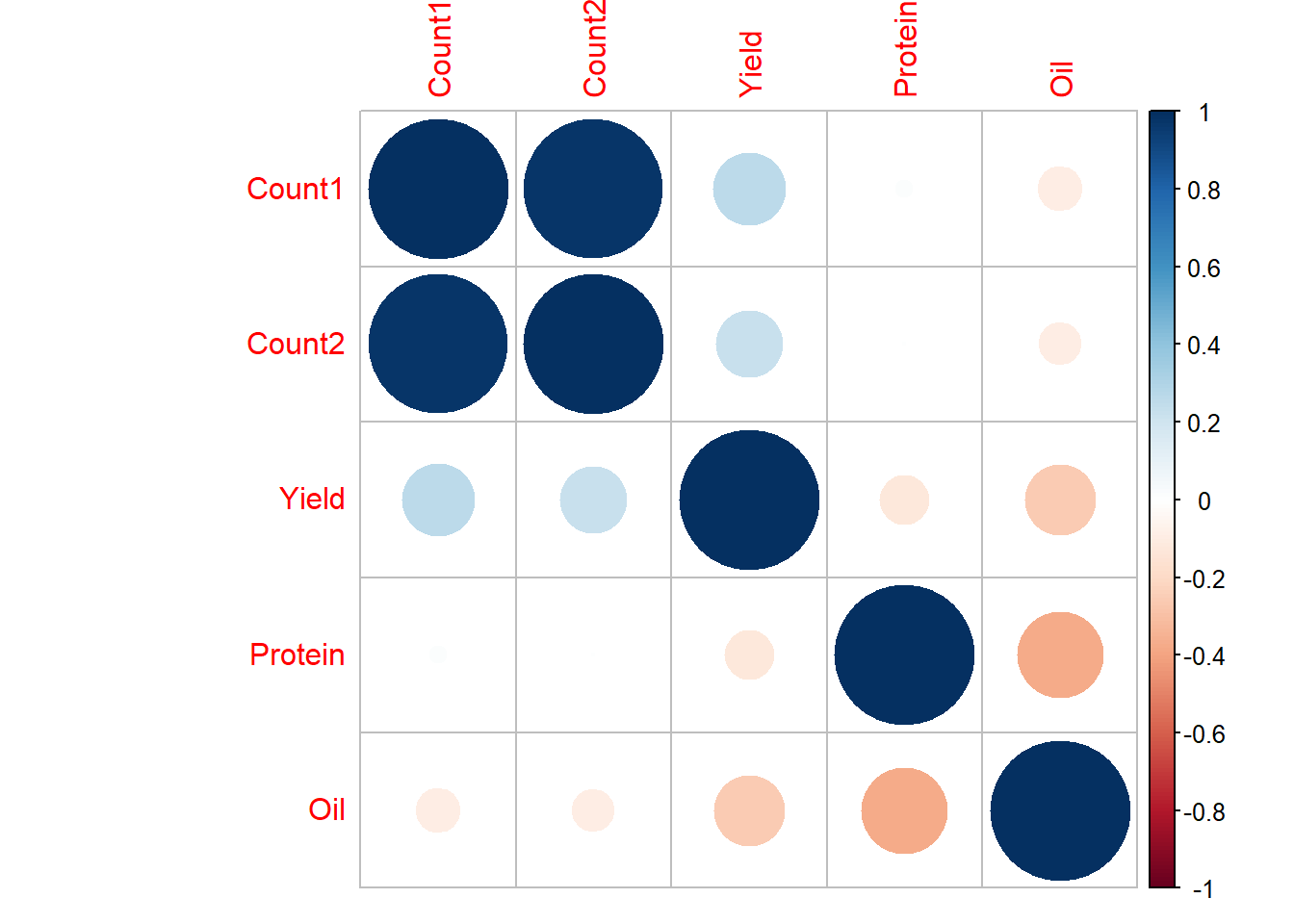
Spearman
This is a non-parametric rank-order correlation analysis.
# Following again from our example.

example_corB <- correlations %>%
  select(-Treatment) %>%
  as.matrix() %>%
  rcorr(type = "spearman")

example_corB
## Count1 Count2 Yield Protein Oil
## Count1 1.00 0.97 0.18 0.06 -0.06
## Count2 0.97 1.00 0.16 0.02 -0.06
## Yield 0.18 0.16 1.00 -0.14 -0.21
## Protein 0.06 0.02 -0.14 1.00 -0.41
## Oil -0.06 -0.06 -0.21 -0.41 1.00
##
## n= 54
##
##
## P
## Count1 Count2 Yield Protein Oil
## Count1 0.0000 0.1843 0.6741 0.6511
## Count2 0.0000 0.2367 0.8616 0.6477
## Yield 0.1843 0.2367 0.3269 0.1366
## Protein 0.6741 0.8616 0.3269 0.0023
## Oil 0.6511 0.6477 0.1366 0.0023# Graphically, following from our initial example.
example_corB2 <- correlations %>%
select(-Treatment) %>%
as.matrix() %>%
cor(method = "spearman")
corrplot(example_corB2, method="number")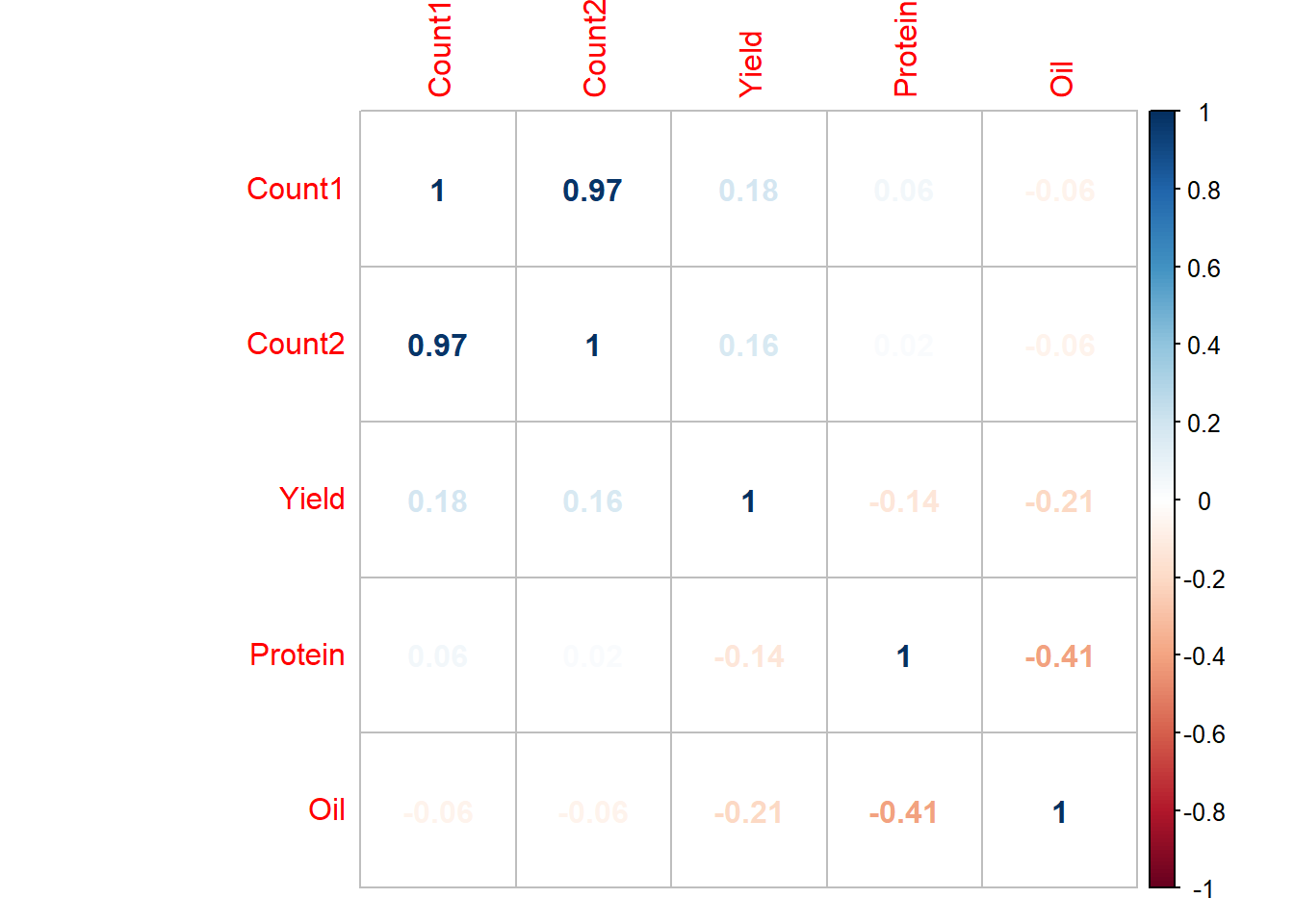
corrplot(example_corB2, method="circle")
Summary
The goal of this introductory example was to provide some of the tools we can apply to calculate different correlation coefficients and graph the results. Remember that with these examples we assume a linear correlation so the intepretation of the results need to consider the biological associations as well (think about this for a correlation coefficient of 0 that has a curvilinear relationship).